TidyTuesday Week 31 (My Week 1!)
#TidyTuesday
TidyTuesday, as I understand it, is a weekly challenge to improve upon your R coding abilities. The data is always freely available and the community is always supportive. See this tweet from the FOUNDER of TidyTuesday on my post (and the super easy code to embed a tweet in your website thanks to tweetrmd and webshot2) –>
tweet_screenshot(tweet_url("thomas_mock", "1288434354637746177"))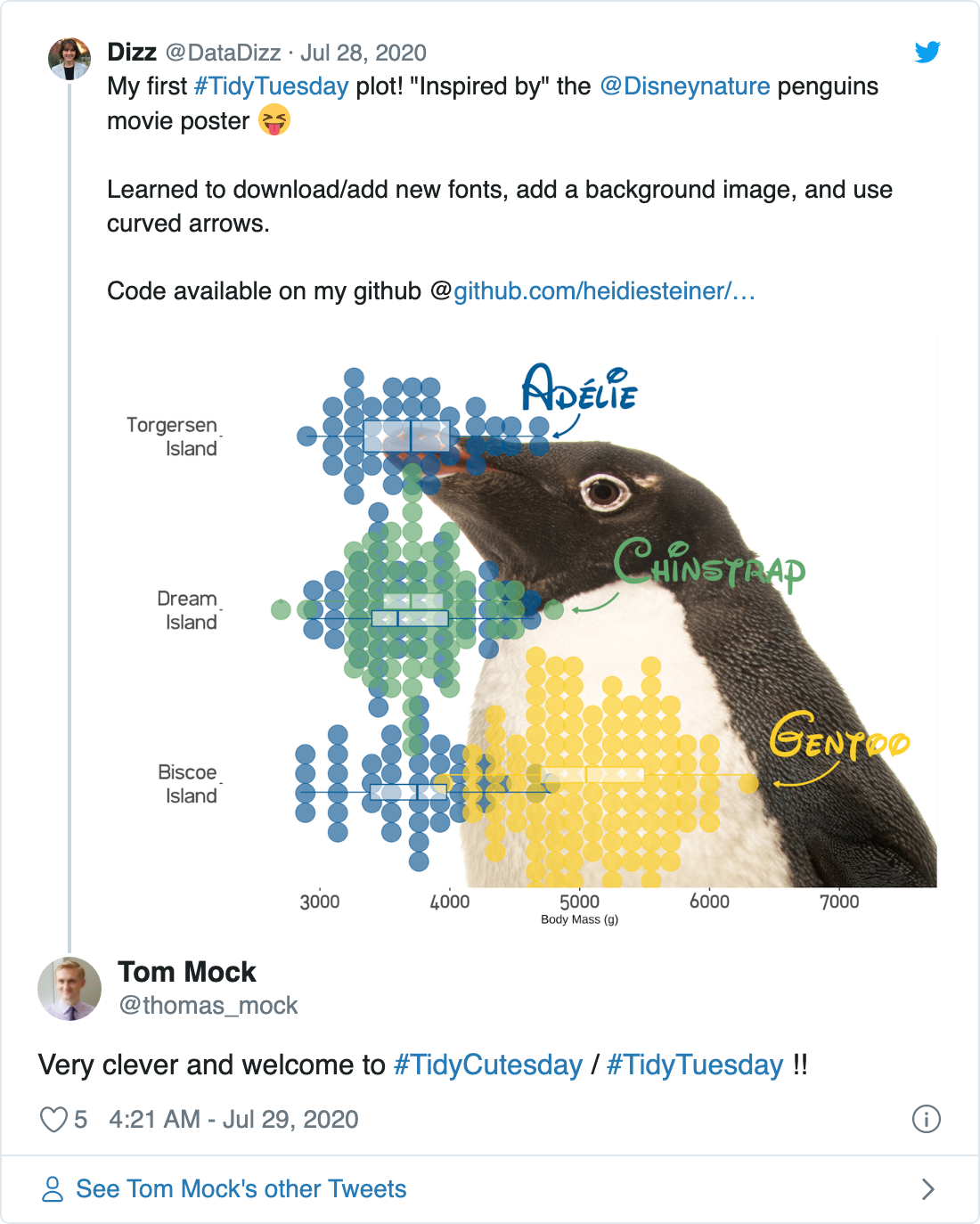
Week 31 - Palmer Penguins
As you may already have figured out, this week’s TidyTuesday data featured penguins! #TidyCutesday is right!! The cleaned dataset includes measurements of bill size, body mass, and island inhabited. As I mentioned before, the data is always available. This week you can load the data via the package palmerpenguins or from github as I show here.
penguins.csv <- readr::read_csv('https://raw.githubusercontent.com/rfordatascience/tidytuesday/master/data/2020/2020-07-28/penguins.csv')Playing with Font
I decided to try a few new things this week. I’ll start with changing fonts. I downloaded free fonts from the internet and added them to FontBook on my Mac. Using the library showtext I loaded my two new fonts.
library(showtext)
## Add the font with the corresponding font faces
font_add("Waltograph", regular = "waltograph42.otf")
font_add("Filetto", regular = "filetto_regular.ttf")
## Automatically use showtext to render plots
showtext_auto()
Then, just as changing fonts before, you can call a font family in theme().
theme(legend.position = "none",
        axis.text = element_text(family = "Filetto",
                                 size = 20)) +
Background Image
Although changing the theme is super easy in ggplot, I wanted to not just change the theme but change the background altogether. I chose a picture of one of the penguin species, Adélie, when it was featured in National Geographic! I just simply saved the jpg to the same folder as my project and then used the jpeg library. (I also learned how to add accents, although I admit I have learned this previously and forgotten.)
library(jpeg)
peng_background <- readJPEG("content/post/2020-07-30-tidytuesday-week-31-my-week-1 background.jpg")
Then you’ll just add to the plot before any geom.
g + background_image(peng_background) Curved Arrow Annotations
Finally, as inspired by a recent blog post by Cedric Scherer titled “The Evolution of a ggplot”, I wanted to learn to add curved arrows. Here’s his final plot:
I wanted to try my hand at these curved arrows. First you need to set up the lines for arrows.
arrows <-
  tibble(
    x1 = c(3.13, 2.1, 1.13),
    x2 = c(3.0, 2.0, 1.0),
    y1 = c(5000, 5300, 7000),
    y2 = c(4800, 4950, 6500)
  )
Then you simply call geom_curve() and add some curvature to it!
geom_curve(
    data = arrows, aes(x = x1, y = y1, xend = x2, yend = y2),
    arrow = arrow(length = unit(0.07, "inch")), size = 1,
    color = c("#005c99",
              "#63a96a",
              "#fad00a"), curvature = -0.3
  )
Proud of my plot this week and can’t wait to learn a few new things next week!
Heidi E. Steiner
Senior Clinical Data Scientist
I love coding in R, biostatistics, and reproducible clinical research.